
Crafting websites that dazzle on all devices is like putting together a digital jigsaw puzzle. In this rollercoaster ride of creativity, we’re going to unpack two super cool tools in our responsive toolkit: containers and media queries.
Unleash the Power of Containers: Think of containers as the superhero capes for your web content. They’re like magical boxes that hold everything together. Whether it’s a catchy heading or a captivating paragraph, containers keep your content snug and organized.
<!DOCTYPE html>
<html>
<head>
  <style>
    .container {
      width: 80%; /* Watch out! Setting the maximum width for our container */
      margin: 0 auto; /* Boom! Centering the container on the page */
    }
  </style>
</head>
<body>
  <div class="container">
    <!-- Get ready for liftoff! Your content goes here -->
    <h1>Welcome to My Galactic Website</h1>
    <p>This is a cosmic example of using a container for your content.</p>
  </div>
</body>
</html>
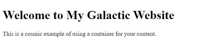
Here is how it looks:

In this example, our container is the cosmic guardian, ensuring our content stays stylishly aligned no matter the device.
Media Queries:
Where the Magic Happens! Media queries are like the chameleons of the web design jungle. They adapt your styles based on the screen’s vibe, whether it’s a giant desktop or a pint-sized mobile wonder.
/* Media query for the smaller screens - time to shake things up! */
@media only screen and (max-width: 600px) {
  .container {
    width: 100%; /* Going full width on smaller screens - unleash the magic! */
  }
}
In this example, our styles dance to the beat of the screen size. When the screen is 600 pixels or less, our container goes all out, filling the screen with its awesomeness.
Mixing Containers and Media Queries:
The Ultimate Web Design Jam! Let’s throw these superheroes into the ring together and watch the magic happen.
Full Code
<!DOCTYPE html>
<html>
<head>
  <style>
    /* Styles for the big screens - cue the epic music */
.container {
  width: 80%;
  margin: 0 auto;
}

/* Media query for the smaller screens - time to shake things up! */
@media only screen and (max-width: 600px) {
  .container {
    width: 100%; /* Going full width on smaller screens - unleash the magic! */
  }
}

  </style>
</head>
<body>
  <div class="container">
    <!-- Get ready for liftoff! Your content goes here -->
    <h1>Welcome to My Galactic Website</h1>
    <p>This is a cosmic example of using a container for your content.</p>
  </div>
</body>
</html>
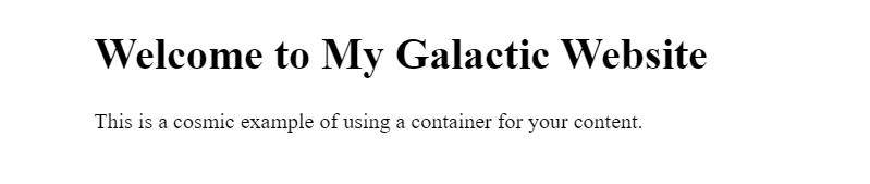
With this combo, your website becomes a powerhouse of style, adapting seamlessly to the ever-changing digital landscape.
Appearance On Width< 600 pixels
Appearance On Width >= 600 pixels
Congratulations, web design adventurer! You’ve just unlocked the secrets of containers and media queries. Now go forth and create websites that not only look stunning but also adapt like shape-shifting wizards on any device. It’s a wild ride, but with containers and media queries by your side, you’re destined for web design greatness! 🚀🎨
Best Regards,
Anmoldeep (@eduanmoldeep)
Team Learner’s Den.